
Overview
No switching tools, no digging through data — just instant clarity so you can understand performance, spot issues fast, and make confident decisions.

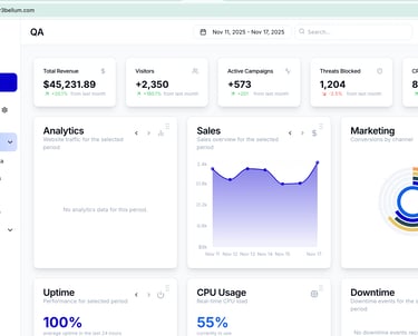
360 Degree View
Gain a complete perspective on your website's performance and operations. Get all your insights in one place, with no need to open, the Google Analytics, pentest tool, and other software.
Our Dashboard will provide you with a an overview, at first glance, of what you need to know and where to improve.
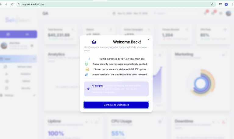

Performance Insights
Utilize advanced AI tools to analyze and optimize website performance. Our app delivers actionable insights for improving user experience and operational efficiency across all web aspects.
The Ser3bellum Dashboard gives you a real-time, unified view of everything that matters across your digital ecosystem.
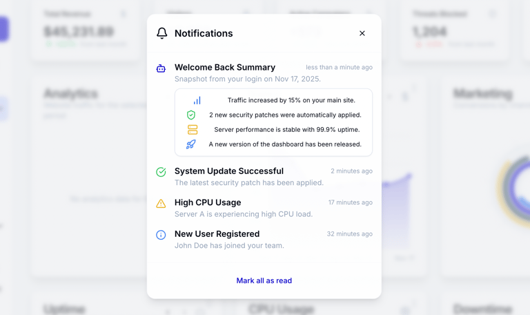
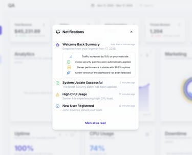
Smart Alerts
Receive instant notifications for any critical website issues detected.
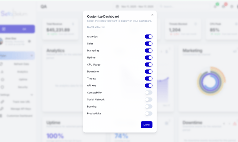

Customizable
The dashboard will focus only what on what you want among a selection of data you want to investigate. The only requirement is the tool needs to be connected to the dashboard.

Integrations
Connected tools powering your dashboard.
Ser3bellum transformed our web operations with its AI-driven insights and comprehensive monitoring capabilities. Highly recommend!
Marc Ranson


★★★★★
SITE MAP
contact
Newsletter
info@ser3bellum.com
ADDRESS:
bureau 326,
59 rue de Ponthieu
75008 Paris
SER3BELLUM — Single-shareholder Simplified Joint-Stock Company (SASU) with share capital of €1 — Paris Trade and Companies Register (RCS) No. 104 100 250 — Paris, France. @©Ser3bellum 2026. All rights reserved
FOLLOW US